How to choose the right oil painting for your space
Finding a painting you love is the easy part. Making it look like it was made for your wall, in your light, in your room, is the part most people skip. I am AnneKarin Glass, an oil painter based in San Francisco, and I spend a fair amount of time helping collectors work through exactly that: matching wall shape, color temperature, and lighting to a piece before it goes up, not after. Get those three right and a new painting feels custom made for the room. Get them wrong and even a piece you love can sit oddly on the wall.
What canvas shape works best for my specific wall space?
Match the proportions of your canvas to the shape of your wall before anything else. Orientation decides how a viewer's eye moves through the room and whether the piece sits in harmony with the furniture around it, or works against it.
Vertical walls (tall and narrow)
Narrow accent walls, the space between two tall windows, and cozy alcoves all call for a vertical composition. A vertical canvas draws the eye upward, makes the most of high ceilings, and fills a narrow gap without crowding the architecture around it.
Square walls and spaces
Symmetrical spots, above a compact console table, beside a doorway, centered on a square wall segment, pair naturally with a square canvas. A piece from my Abstracts collection tends to work especially well here: the geometry of an abstract composition and a square format reinforce each other instead of competing.
Horizontal walls (standard rectangles)
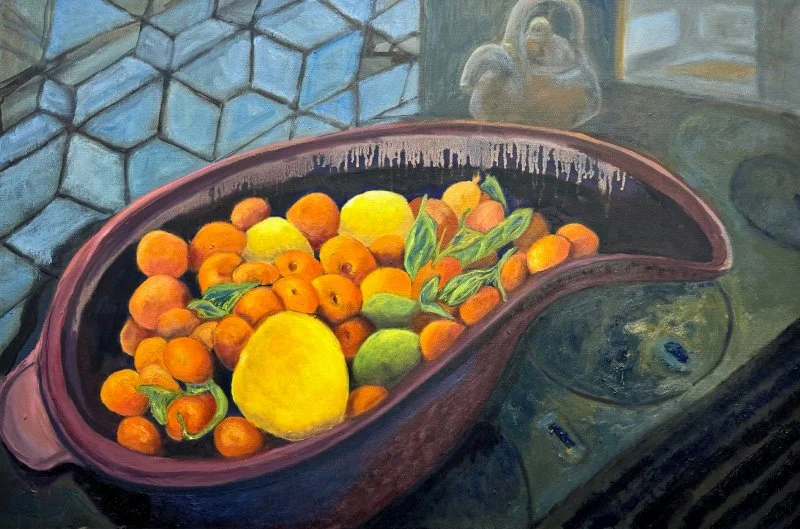
Broad, open spans above a sofa, a dining credenza, or a headboard call for a wide, horizontal painting. A piece from my Still life collection fills that kind of space comfortably, since the format naturally follows your horizontal field of vision and grounds the furniture beneath it.
Expansive horizontal spaces (the three-canvas grouping)
A long hallway or a large, open wall often needs more visual movement than one canvas can give it. Placing a set of three gesture paintings side by side spans that distance smoothly, adding rhythm across the wall without the weight of one oversized frame.
How does room color temperature affect an oil painting?
Consider how the warm or cool tones already in your room interact with the pigments in a painting before you hang it. Sunlight, your lightbulbs, wall paint, and wood finishes all set an ambient temperature that either blends with your artwork or pushes against it.
Warm environments
Natural wood floors, cream or beige walls, brass fixtures, and warm sunlight all bring out the golden, yellow, and earthy undertones already present in oil paint.
Cool environments
Light gray walls, white marble, polished chrome, or indirect northern daylight do the opposite: they pull out the blues, deep greens, slate grays, and crisp whites in a painting instead.
Should my painting blend in, amplify the space, or contrast with the room?
Decide whether you want a piece to reinforce the mood already in the room or to work as a dynamic focal point. Where a painting falls on the color temperature spectrum relative to your room changes which of those two things happens.
Amplifying the atmosphere
A warm-toned painting in an already warm room turns subtle warmth into a bold, inviting focal point. A landscape piece with golden light does this well. The same logic runs in reverse: a cool, slate-hued canvas in a cool room deepens the sense of calm instead of disrupting it.
Seamless integration (blending in)
Matching the color range of your interior creates a quiet, unified space. The painting reads as an extension of the room's architecture rather than something competing for attention.
Direct contrast (making a statement)
A cool blue or forest green canvas inside a warm, golden room creates immediate visual tension. That contrast is what cuts through a uniform space and pulls the eye straight across the room.
Enlivening neutral interiors
In a space built entirely around quiet neutrals, an expressive, color-rich painting introduces personality and energy that the room's palette alone cannot.
How do I properly light an oil painting in a dark or dimly lit space?
Use dedicated artificial lighting to bring out oil pigment and surface texture whenever natural daylight is not available. Daylight reveals the true depth of a color, but the right picture lighting can make a painting the focal point of a room in any light.
Frame-mounted picture lights
A low-profile picture light mounted directly on the frame lights the canvas evenly. Choose an LED fixture so it does not cast heat or ultraviolet light onto the paint over time.
Ceiling spotlights and track lighting
Position an adjustable spotlight at roughly a 30-degree angle to the wall. That angle lights the surface fully without throwing harsh glare or long shadows across any impasto texture.
Bulb quality
Look for a Color Rendering Index (CRI) of 90 or higher so the pigments read accurately. Warm 2700K to 3000K bulbs suit warm interiors, and 3500K to 4000K bulbs suit cooler, more modern settings.








Frequently Asked Questions
-
Look at your main light sources and existing finishes. If you have warm LED bulbs (2700K), natural wood, and gold or brass accents, your space skews warm. If you rely on cool daylight bulbs (4000K+), gray walls, white marble, or chrome accents, your space skews cool.
-
Yes. A cool blue or green painting in a warm wood room creates direct visual contrast, which is exactly what makes it read as an intentional, energetic centerpiece rather than a mismatch.
-
Instead of searching for one oversized piece, hang a set of three coordinating paintings side by side. Grouping three canvases spans a wide wall while keeping the layout light and dynamic instead of heavy.
-
Look at your main light sources and existing finishes. Warm LED bulbs, natural wood, and gold or brass accents mean your space skews warm. Cool daylight bulbs, gray walls, white marble, or chrome accents mean it skews cool.
-
Wall color first. Furniture is easier and cheaper to adjust than a wall, and the wall is what sits directly behind the painting and shapes how its colors actually read.
-
Daylight carries a full spectrum of light that brings out deep glazes and rich pigment. Standard overhead room lighting at night often misses the canvas entirely or has a low Color Rendering Index, which is why a dedicated picture light or spotlight matters after dark.