Paint a human figure inside a perfect 1:1 square and you understand fast why so many painters avoid the format altogether.
A rectangle gives you an easy out. The negative space does half the work: a standing figure claims the vertical, a reclining figure stretches along the horizontal, and the eye already knows which way to travel before you have made a single decision.
A square gives you nothing. Its four equal sides squeeze in from every direction at once, turning the exact center into a gravity well. Park a figure there and the composition goes flat. Push it to one side and the opposite corner turns into dead weight. There is no default position that works, which is exactly why I keep coming back to it.
To paint a figure inside a square, you have to treat the body as a puzzle piece rather than an object with a fixed shape. You manipulate it, distort it, and build tension where the frame wants stillness. It is the opposite of a comfortable painting problem, and that is the appeal.
I have taken on that problem three times, in Lorraine, Looking at You, and Impossible Woman, oil on canvas, each one square. None of them solve it the same way. Between the three: brutal foreshortening, forced perspective, deliberate anatomical distortion, and hard shifts in value. Four different arguments against the same rigid shape, using whatever tool the pose demanded.
1. Lorraine: the diagonal instead of the grid
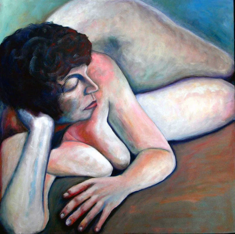
The fastest way out of a square is to ignore its two axes altogether and run the figure along the one line the frame does not offer you: the diagonal. In Lorraine, the pose runs corner to corner, and the eye never gets near the dead center.
How it works
I built the composition around brutal foreshortening. From my angle, Lorraine's torso disappeared behind her own upper body, so the solution to where the mass should go was already sitting in the pose itself, I did not have to invent it. Her right elbow, the point closest to the viewer, props up her head and compresses her chest into a tight, dense knot. The eye lands on her face first, calm, sitting right above that compression, before it has any chance to wander toward the corners.
Keeping the eye moving
A square punishes a static pose, so I kept the body looping back into itself. Her left shoulder tucks behind her head, the arm drops, the forearm sweeps forward again, and the hand nearly meets her right elbow in the bottom left corner, an anchor of intersecting lines that keeps that quadrant from feeling empty. To balance that weight, I stretched her lower body the other way: the left hip rises off the top edge behind her head, the thigh drops to meet the right knee near the midline of the canvas's right side. That single mass, running from the top of her head through the top edge and down the right side, is what makes the diagonal read as a full circuit instead of a straight line, and what lets the composition fill a square instead of merely occupying it. The warm, close palette does the rest, holding the whole loop together as one shape rather than a chain of separate parts.
2. Looking at You: distorted scale, hard shadow
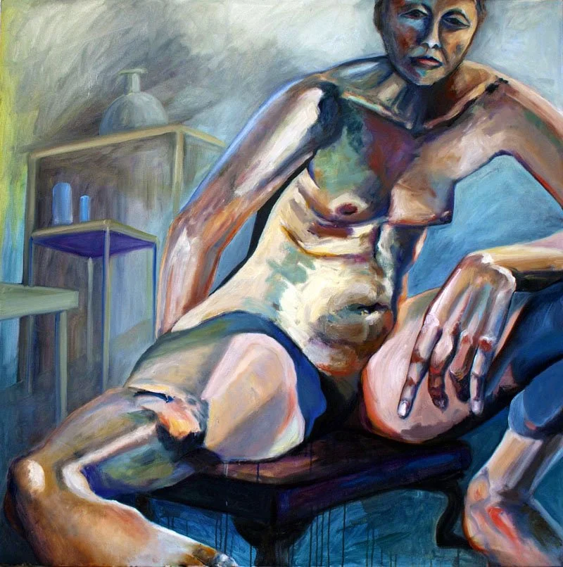
Where Lorraine runs on a diagonal, Looking at You takes the square head on, using aggressive perspective and outright anatomical distortion to carve depth out of a flat plane.
How it works
A seated figure with open legs on a square canvas collapses into a triangle almost by default, a stable, boring pyramid. I broke that by pushing an aggressive twist into the perspective: she is seated on a low stool, body open toward the viewer, right leg kicked so far forward that the foot claims the bottom left corner. To make that foot hold its ground, I bent the ankle further than the anatomy allows. It is a deliberate distortion, but it does real work: it catches the eye right before it slides off the edge of the canvas and sends it back into the painting rather than out of it.
The left leg bends at the knee, foot planted near the stool, wrist resting loose on top of it. Because that hand sits so much closer to the viewer than the torso does, I enlarged it well past its real proportion. An oversized hand set against an elongated, twisted foot creates an immediate foreground plane and pushes the rest of the body back into deep space, doing in paint what a wide-angle lens does in a photograph.
Using light as a tool
Distortion alone was not enough, so I backed it with a deliberate light strategy: deep shadow across the face and upper body, physically pushing them back into the room, and bright, crisp light on the right foot, the enlarged hand, the thigh, and the belly, pulling them forward into the foreground.
The contrast plays against her posture. Her expression is direct and open, but the dark values keep pulling it back into the room, so the eye has to travel the full distance from the lit foreground to the quiet authority of her face before the painting resolves. That distance, built entirely from value rather than line, is what turns a flat square into a room with real depth.
3. Impossible Woman: a knot of mass and texture
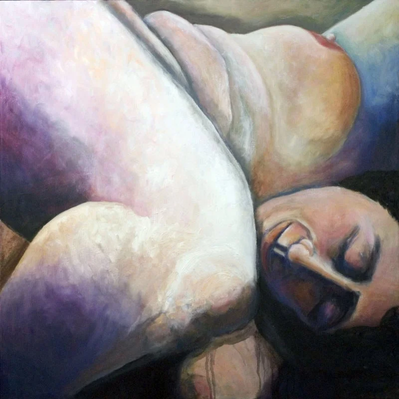
The most complex of the three solutions is Impossible Woman, where I dropped conventional anatomy in favor of a dense, interlocking knot of form, treating the body less as a pose and more as a landscape of mass, brushwork, and color.
How it works
The figure coils into a tight, self-contained geometry. The elements closest to the viewer are not the face or hands but the broad planes of a shin and the sweep of a thigh, a wall of flesh that establishes weight and presence before anything else registers. Behind the crook of the knee, a peaceful, smiling face appears. Above and behind it, a breast, then the armpit, then the start of an arm. The torso is barely a suggestion, tucked under the edge of the canvas. Because every line in the figure loops back into another, the eye rotates continuously inside the frame instead of exiting it: an anatomy that should not hold together on paper but reads as balanced once it is compressed inside the square.
Stroke and color
The geometry only works because the surface handling backs it up. The brushwork is rhythmic and directional rather than blended flat: every stroke follows the roundness of the limb it describes, building volume through repetition rather than smoothing it away, the way a sculptor's tool marks stay visible in the final form.
A sharp color shift reinforces the same rhythm. Where the shin and thigh catch the light, the palette pushes to an almost blinding white. Where the form turns away from the light, it drops into a saturated violet rather than a neutral black or brown, keeping the shadow active instead of dead, and giving the face and breast a quiet chamber to rest in. The brushwork builds the terrain, and the color decides which parts of it stay lit and which fall away.
The takeaway
None of these three paintings treat the square as a passive container. Each one negotiates with it directly: a diagonal that turns weight into a circuit, a twisted perspective backed by hard light, or a knot of paint that keeps the eye moving in place of a pose. The method changes every time, because the pose dictates the method, not the other way around. What does not change is the requirement itself: master the geometry of the canvas before it limits the truth of the figure.
These are only three solutions to one problem. More live in the Figures collection of this site.
Frequently asked questions
Why is a square canvas harder to compose than a rectangle?
A square has no dominant axis, so it gives a figure no natural direction to follow. A rectangle's negative space does some of the compositional work automatically; a square resists it and pulls everything toward a dead center instead.
What techniques help avoid a static composition in a square format?
Running the figure along a diagonal, using forced perspective, distorting scale, or building a self-contained loop of shapes are all ways to keep the eye moving instead of settling in the dead center of a square canvas. I used a different one of these in each of the three paintings above.
Why use anatomical distortion instead of accurate proportions?
Distortion works here as a structural tool, not a mistake. Bending an ankle further than anatomy allows, or enlarging a hand past its real size, keeps the eye moving inside the frame and stops it from sliding off the edge of the canvas.
Do all three paintings solve the square in the same way?
No. Lorraine relies on a diagonal composition, Looking at You uses forced perspective and dramatic lighting, and Impossible Woman builds a self-contained knot of form and color. Each pose demanded a different solution.
Where can I see more of these paintings, or learn more about the artist?
All three paintings, along with the rest of my figurative and abstract work, are available to view in the Collections section of this site. You can also read more about my background and practice on the artist page.